
NHL Stanley Cup Type

BrANDING DEVELOPMENT
Client: National Hockey League (NHL)
Collaboration with Fanbrandz
Artist: Jason Carne
There’s something special about working with a major sports entity.
Sports have this uncanny ability to bring people together and divide them in a way that creates a deep-seeded rivalry. Being based in the South, we know all too well the allegiance people can have to their teams. Being given the opportunity to work with the NHL was truly memorable. It took me back to my childhood watching the Detroit Red Wings in the ‘90s on TV.
We were selected to develop the serif type that would be used to rebrand that Stanley Cup and related assets for the foreseeable future.
HOW THE WORK CAME TOGETHER
We drew our inspiration for this font from the cup itself. Over the decades of NHL history, many engravings have been made notating winners of the Stanley Cup. Taking high resolution photography of the cup, we sifted through the engravings to find letter styles and shape language that communicated the history of the NHL while ensuring that it was both stylish and timeless. Through the rounds of roughs and revisions, we were able to find what would eventually become Victoria SC Serif.
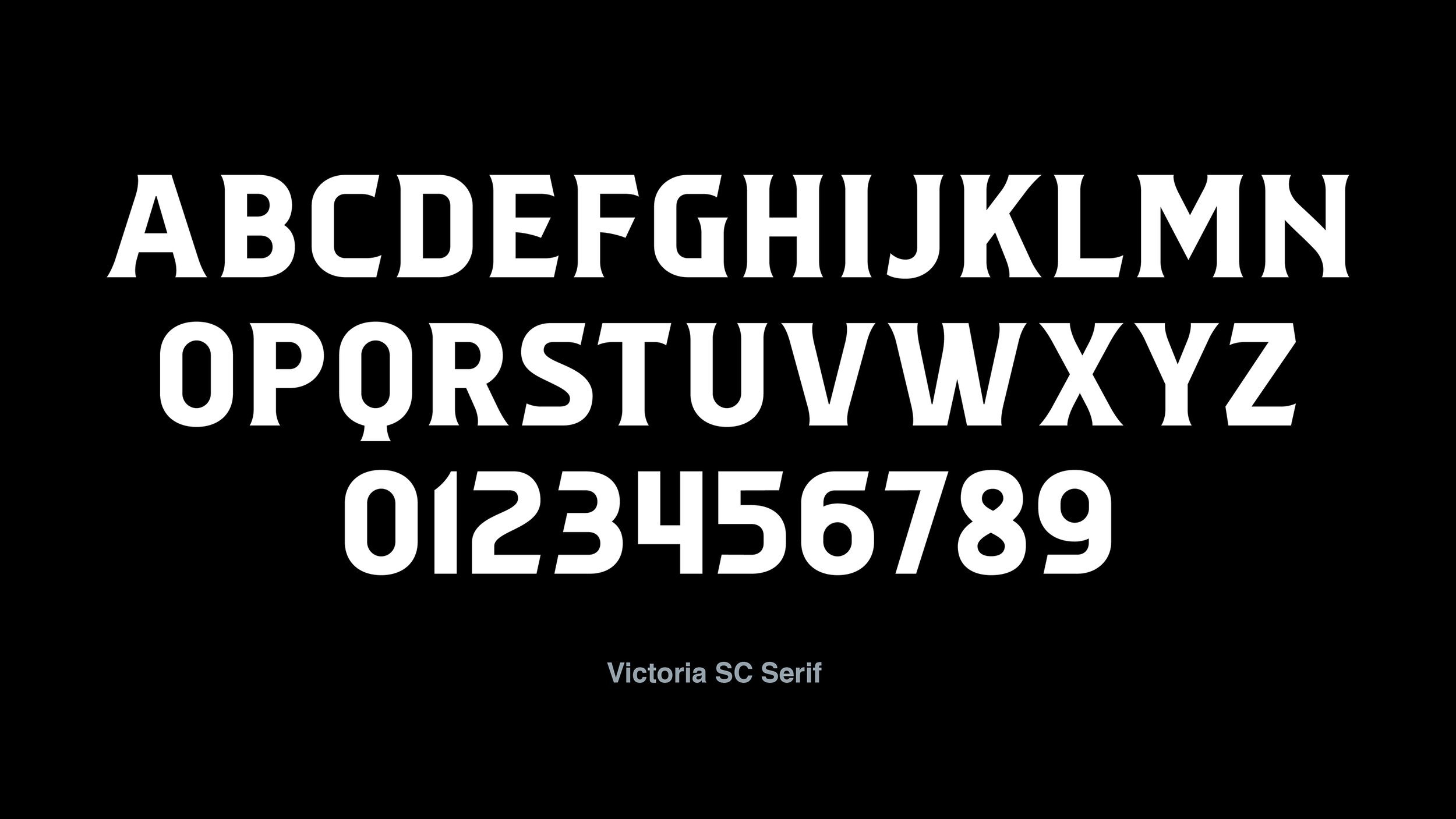


“In a once-in-a-lifetime opportunity, I got to take part in the rebrand of the most prestigious trophy and event in all of hockey, The Stanley Cup. Fanbrandz initially contracted me to complete the lettering for the words “Stanley Cup” and the numerals which change annually, but eventually this ask turned into developing a full typeface called “Victoria Serif SC” for the NHL to use internally for marketing and promotional materials. This lettering was all inspired by some of the masterfully executed engravings on the cup itself, binding this modern rebrand to the cup’s storied history of over 130 years.”
Jason Carne | Artist
EVEN MORE STUFF